Meet Fyra: A Fitness App Designed for Women to Work With Their Bodies, Not Against Them
This project focuses on designing a new mobile application that addresses a specific wellness-related challenge. The goal is to create a accessible solution that supports healthier habits, improves well-being, and make wellness tools easier to integrate into everyday life.
Client:
Ironhack
Role:
Lead Designer
Year:
2025

The Challenge
Overview
We worked on a cycle-based fitness app for women who want to stay active but struggle to adapt workouts to their menstrual cycle. Most fitness apps ignore hormonal changes, which leads to guilt, inconsistency, and burnout. After conducting secondary research, user interviews, and usability testing, we saw the same pattern repeating: women want to move, but they don’t know how much, when, or what kind of exercise fits their cycle.
DESIGN PROCESS
Design Time line

Qualitative/
Quantitative Interviews
After the competitor analysis, we conducted qualitative and quantitative research through surveys and interviews.
Our goal was to understand the challenges women experience across different cycle phases.
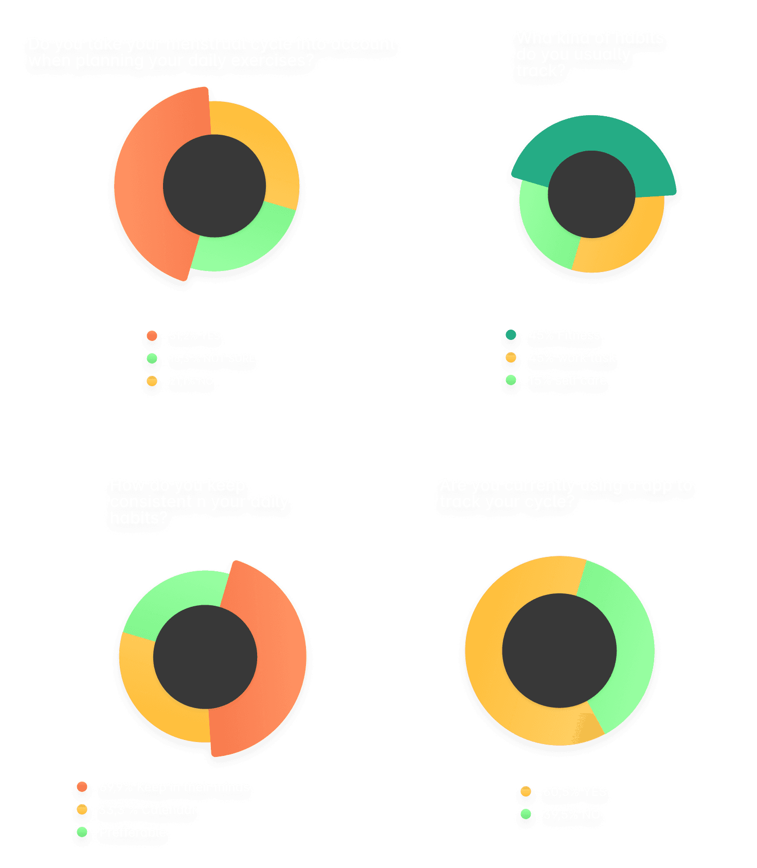
From surveys and interviews with 50+ women, we learned that woman’s prefer to track their cycle and fitness activities in one place, while also wanting to monitor their overall health — not just workouts.
User Persona
To design the experience, I first created a user persona that represents the target user of the product. The goal was to better understand the user's needs, motivations, behaviors, and pain points when choosing a workout based on their menstrual cycle.

User Journey Map
The journey was divided into five stages: orientation, understanding body context, evaluating the recommendation, deciding what to do, and feeling confident in the decision. For each stage, I mapped the user’s actions, thoughts, emotions, pain points, and touchpoints to identify moments where the experience could be improved.
This process helped reveal key friction points, such as information overload, unclear explanations of cycle phases, and lack of trust in workout recommendations. From these insights, I defined several design opportunities, including simplifying the dashboard, clearly explaining how the cycle phase affects training, and providing alternative workouts with similar intensity levels.
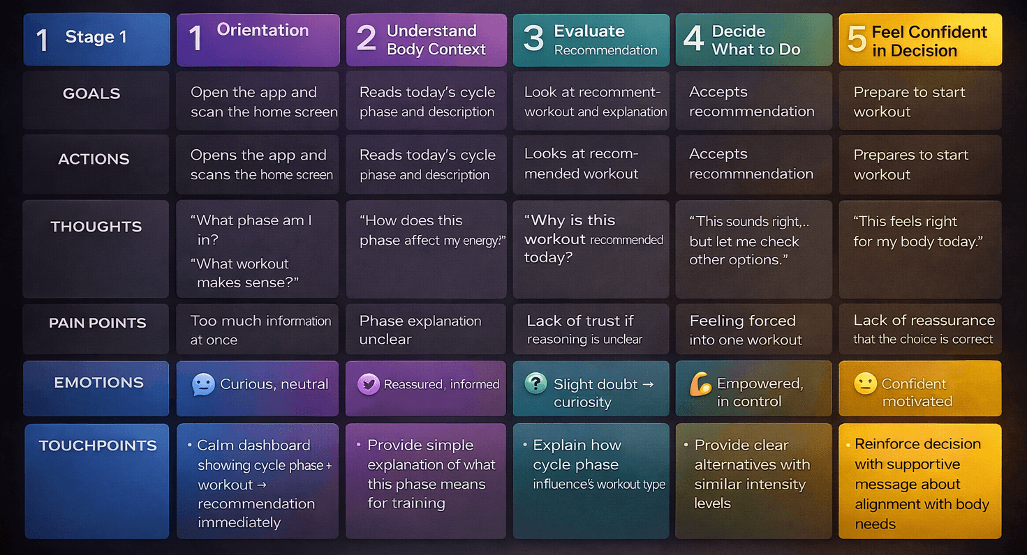
To structure the journey map, I used desk research on cycle-based training, UX mapping frameworks, and ChatGPT as a support tool to help organize insights, refine user thoughts and emotions, and structure the journey stages.
Style Guide

Information Architecture
After analyzing the app, we decided to focus on helping users find workouts that match their menstrual cycle phase. The goal is to make it easy for users to see exercises that suit their body and energy levels at different stages of their cycle.
The Home screen gives a quick overview of the user’s current cycle and shows the recommended workout for the day. In the Workouts section, exercises are organized by cycle phases so users can easily find routines that fit where they are in their cycle.
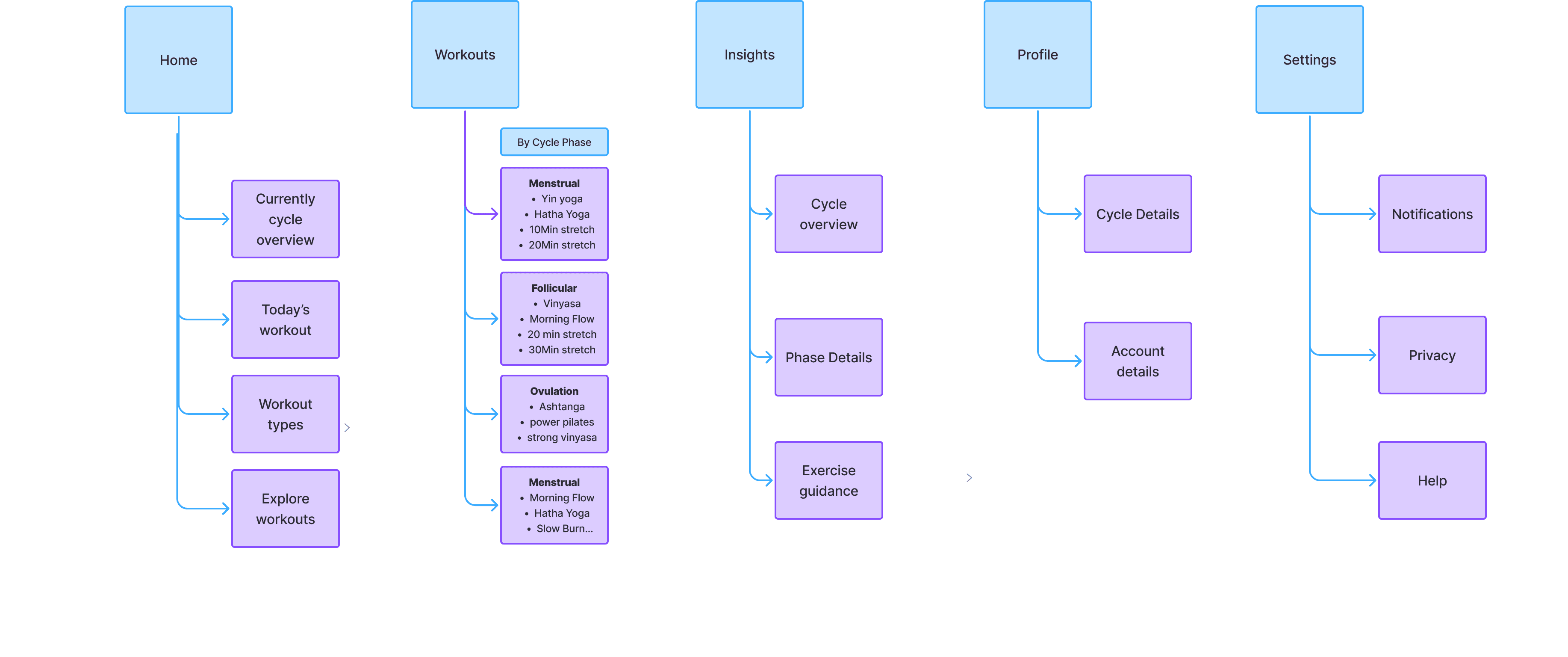
The Insights section helps users understand their cycle better, while Profile and Settings allow them to manage their personal and app preferences.
User flow
Designing the app’s flow was the most challenging part of our process. We spent a lot of time thinking through different possibilities and refining the structure to make sure everything made sense.
In the end, we created a flow that feels simple and easy to follow. The user doesn’t have to think too much about what to do next—the app guides them naturally from opening the app, viewing their cycle information, choosing a workout, and completing it.

MVP-Sitemap
We begin with a mandatory onboarding to collect only essential information — name, email, and cycle data — so the app can personalise the experience from day one.
The home page acts as the user’s anchor, from here, we can quickly access workouts, insights, profile and settings without friction.
Minimum data for maximum value
Trust and clarity first

“We prioritized the core flow first — onboarding, personalized workouts, and cycle insights — and moved secondary features like profile and settings out of the main experience to keep the MVP focused and usable.”
The workouts section supports two user intentions: following a recommended workouts or exploring all available options.
The insights section is simple, focusing on cycle-related insights to help users understand their body without complex data.
Profile and settings are separated from core actions so they’re accessible when needed, but don’t distract from the primary experience.
Low-Fidelity Wireframes
Transforming the user flows into screens was a fun step in the process. At this stage, we focused on translating the main user actions into simple layouts and understanding how users would navigate through the app.
Our competitor analysis helped us prioritize key features, such as displaying the current cycle phase on the home screen and creating an Insights page to explain how the cycle affects workouts.

We also explored AI tools like Stitch, which helped us quickly visualize different ideas and refine the overall structure of the app.
The goal of the low-fidelity wireframes was to define the layout, navigation, and information hierarchy before moving into mid-fidelity designs.
Mid-Fidelity Wireframes
Onboarding Flow
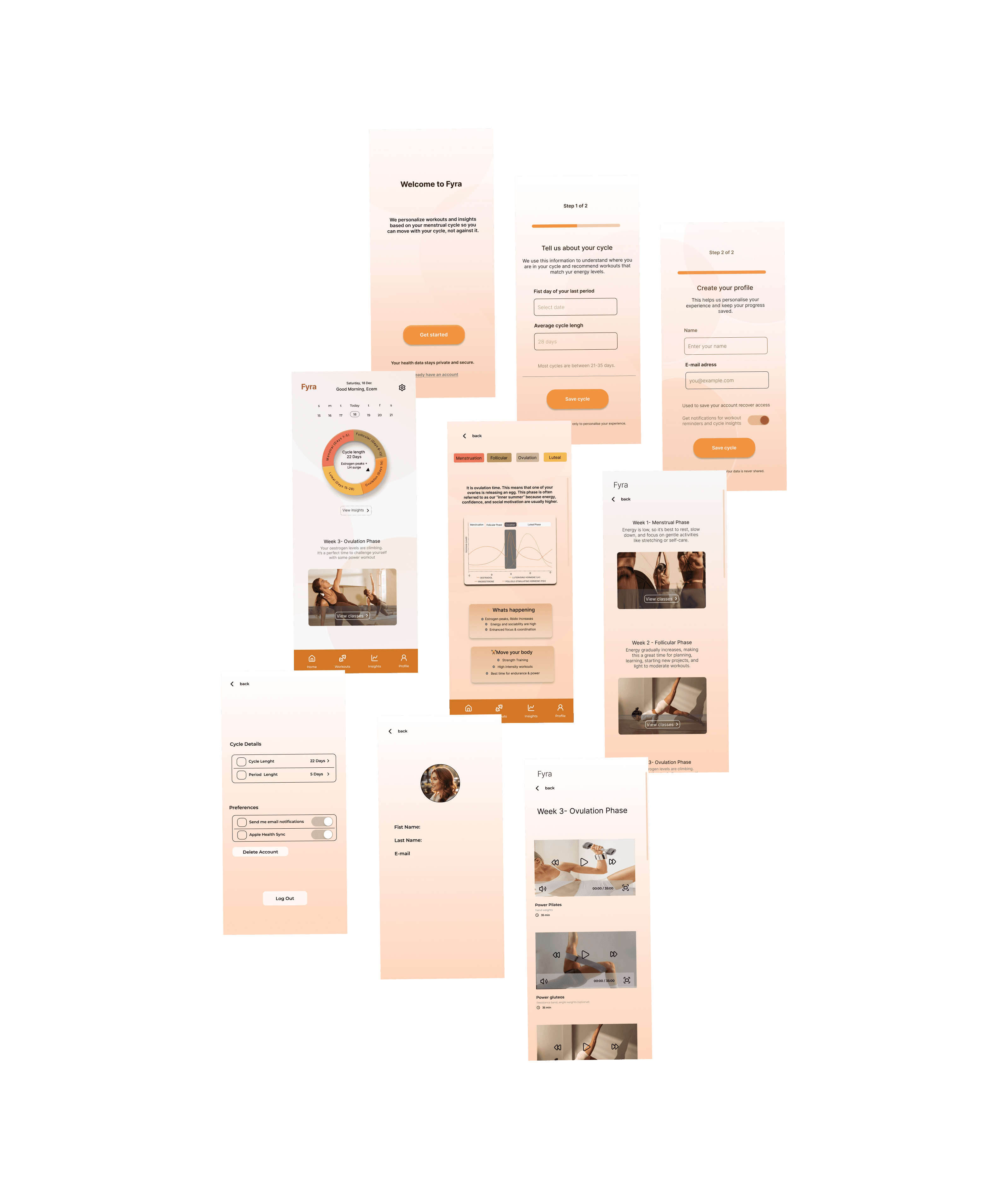
When users open the app for the first time, they see a short introduction explaining how the app personalizes workouts based on their menstrual cycle. After tapping “Get Started,” users enter their cycle information (first day of the last period and average cycle length), provide basic profile details, and choose whether to enable notifications.
This process allows the app to deliver personalized workout recommendations from the start.

Home
The Home screen provides a quick overview of the user’s current cycle phase and recommended workout. It also shows a visual cycle tracker to help users understand where they are in their cycle and easily access suggested workouts for that day.
Insights
The Insights page provides educational content about the menstrual cycle and how it affects energy levels and training. Designing this section was initially challenging because it required finding the right balance between useful information and simplicity. After research and testing different approaches, the final solution focuses on clear explanations, visual graphs, and short guidance to help users understand how to adapt their workouts during each phase.
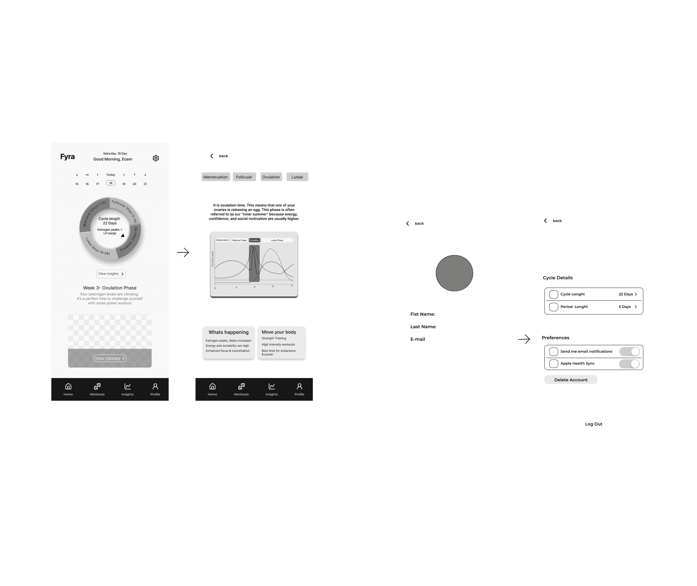
Workouts
The Workouts section presents workout recommendations based on the user’s cycle phase. Users can explore different classes, view workout videos, and read descriptions or comments from other users. The goal is to make it easy to select and start a workout that matches their energy level and cycle stage.

High fidelity wireframes
At the high-fidelity stage, we transformed our wireframes into a refined and visually consistent interface. We applied heuristic usability principles, focusing on clarity, hierarchy, and visibility of key information so users can quickly understand their cycle phase and workout recommendations.
Collaboration was a key part of this process. Working with a partner allowed us to review decisions together, challenge assumptions, and iterate more effectively. Through constant feedback and discussion, we were able to solve design problems and refine the experience.
This stage reinforced an important UX insight: strong design outcomes come from combining user-centered thinking with collaborative iteration and continuous evaluation.