Fintoc Payment App
Client:
Fintoc
Role:
UX/UI Design
Year:
2026

The Challenge
Overview
Fintoc is a Chilean fintech that enables instant bank-to-bank payments — no cards, no extra apps. Users pay directly from their bank via a secure link or through the fintoc.me platform.
We were brought in to design a new feature: saving external recipients (non-Fintoc users) to a contacts list. A small-sounding addition that turned out to be a deeper UX challenge than expected.

The Problem
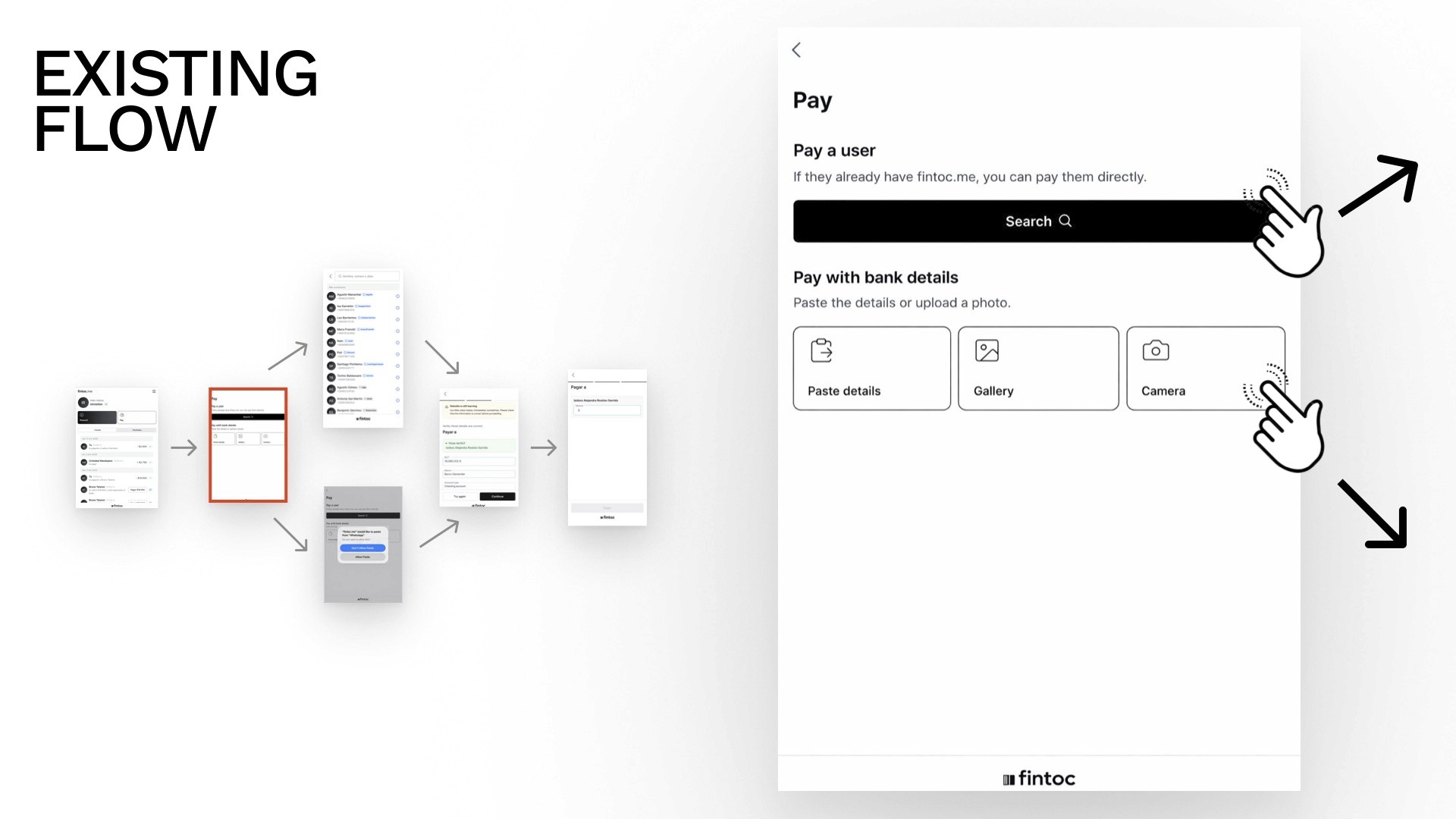
Every time a Fintoc user sent money to someone outside the platform, they had to re-enter that person's bank details. The app didn't store them.
For frequent transfers — rent, splitting bills, paying freelancers — this created real friction. Users were copying and pasting data manually, every single time.
"The app does not store their details. As a result, users must re-enter or paste the recipient's information every time they want to send money again."


Our goal: Let users save external recipients to their contacts list during or after a transfer, making future transactions faster and reducing errors.
Target Audience
Digital-first users who expect seamless money movement:
Young professionals managing day-to-day P2P transfers
Freelancers paying or receiving from clients across different banks
These users are comfortable with mobile banking but have low tolerance for repetitive friction.
Research
Existing Flow Audit
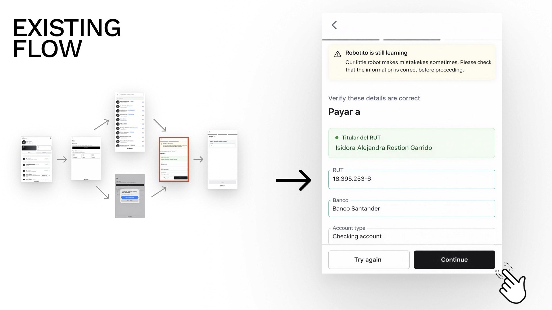
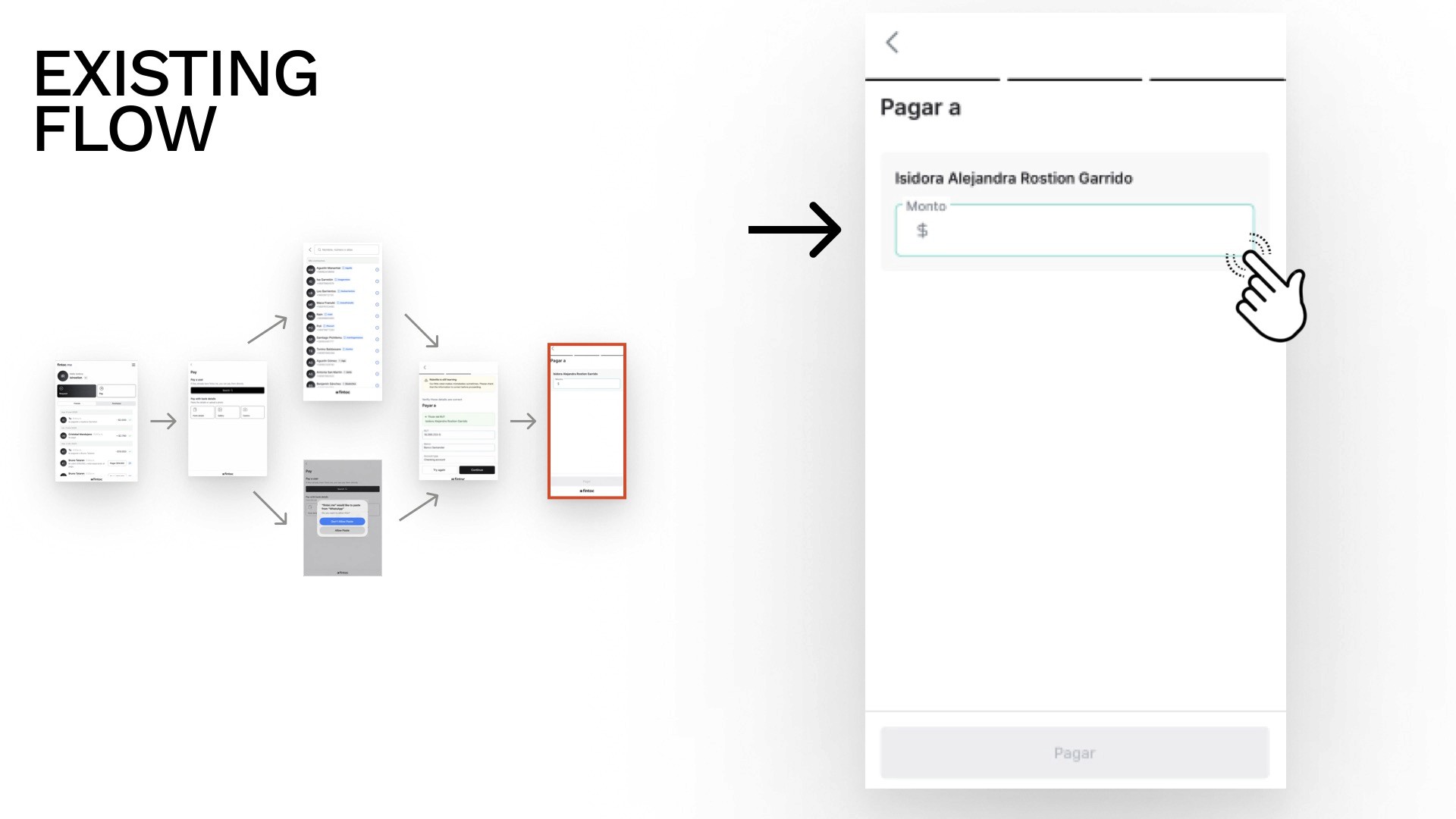
We started by mapping the current Fintoc experience end-to-end — from initiating a payment to completion. The existing flow was clean for internal (Fintoc-to-Fintoc) transfers but had a clear gap: once a payment to an external contact was sent, nothing was saved.
Competitor Analysis
We looked at how similar apps handle external contacts and identified key patterns — and failures:


What worked | What didn't |
|---|---|
"Recent" contact display for quick access | Payment pages are overloaded with options |
Strong visual hierarchy for contact discoverability | No external contact option at all (some apps) |
Complete bank detail confirmation at the final step (builds trust) | Low-prominence "add" actions (hidden, easy to miss) |
Clear contact grouping (internal vs. external) | Screens that added friction with no value |
These findings gave us a clear design direction: make saving external contacts feel native to the payment flow, not like an afterthought.
Design Process
Low-Fidelity Exploration
We built low-fi wireframes to quickly test layout ideas before committing to anything. This phase surfaced 6 key design decisions.
Consideration 1 — Payment Page: Tabs or No Tabs?
We explored showing "Fintoc Friends" and "New Contacts" as separate tabs vs. a unified view.

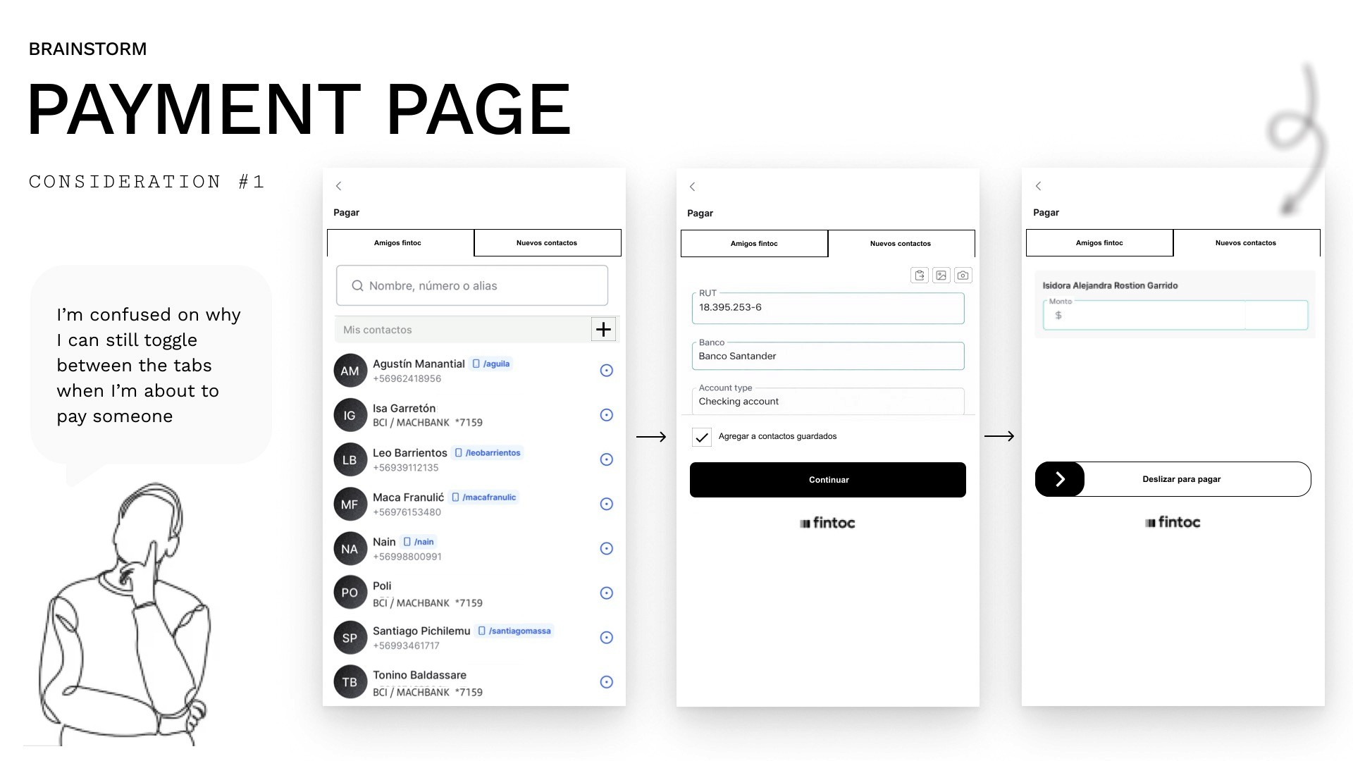
Decision: Remove the tabs from the payment flow. During testing, a user noted: "I'm confused about why I can still toggle between tabs when I'm about to pay someone." The tabs added cognitive load at the wrong moment. We unified the view.
Consideration 2 — Where to Surface Favourite Contacts?
Option A: Show favourites on the Home screen.
Option B: Show favourites on the Payment page.


Decision: Payment page. Showing favourites on Home felt random and out of context. At the moment of payment, a visible shortcut to frequent contacts is immediately useful.
Consideration 3 — How Many Favourites to Show?
Option A: 3 visible, rest scrollable.
Option B: 6 visible at once.


Decision: 3 visible + scroll. Showing 6 cluttered the screen and weakened the visual hierarchy. Limiting to 3 kept the interface clean while still offering access to more via scroll.
Consideration 4 — Bank Details Entry: Overlay or Full Screen?
Option A: Slide-up overlay panel for bank details.
Option B: Full-screen form.
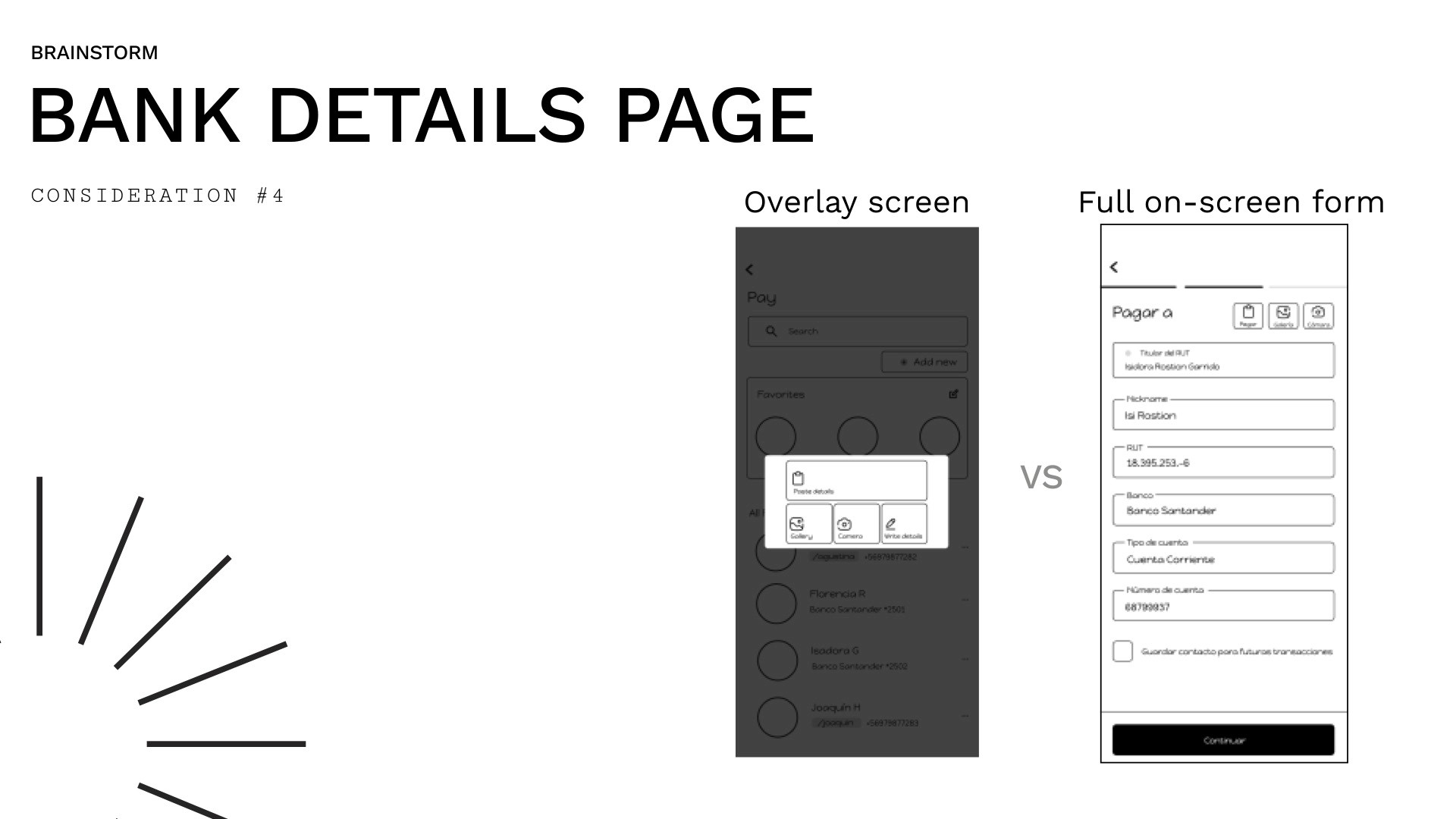
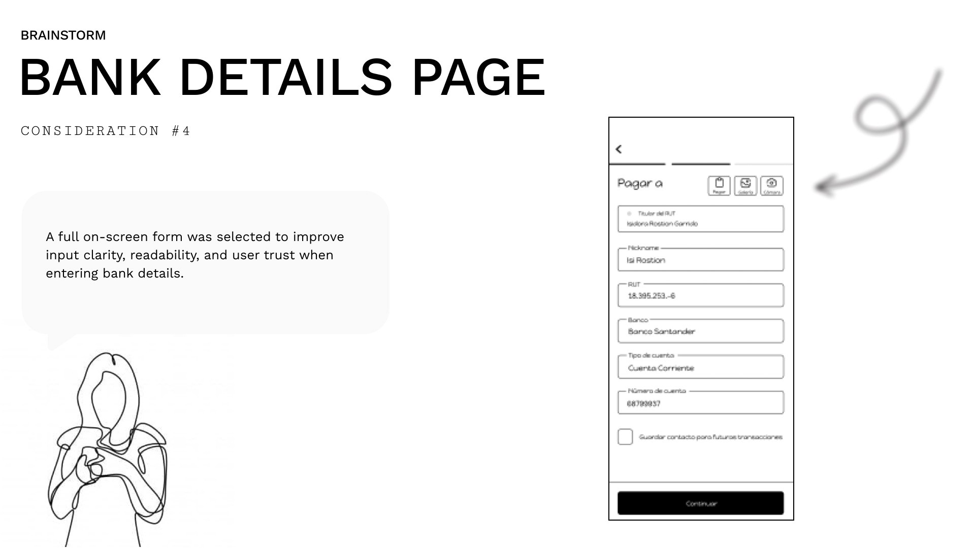
Decision: Full-screen form. Entering sensitive financial data needs focus and clarity. An overlay felt cramped and less trustworthy.
Consideration 5 — Amount Page: One Design or Two?
We had two slightly different "amount" screens — one for external transfers and one for internal transfers. They were almost identical but looked like different pages.


Decision: One unified design. The difference wasn't meaningful to users and added unnecessary inconsistency to the design system.
Consideration 6 — Home Page: Announcement Bubble
The existing home page had labels that visually looked like clickable buttons but weren't. During testing: "I thought the announcement was clickable... what is it for again? Why is there an arrow too?"


Decision: Redesign as a clearly disabled state — no arrow, no deceptive affordance.
Solution
High-Fidelity Design
With decisions locked, we moved to high-fidelity. We worked within Fintoc's existing design system, though we had to rebuild and clean up components — the original library had inconsistencies in how properties were organised.


We improved the component library structure before building screens, which made the hi-fi phase faster and more consistent.


Key Screens Designed
Payment page with favourites strip (3 visible, scrollable) and unified contact view
External contact entry form (full-screen, step-by-step bank detail input)
Save recipient prompt triggered post-transfer with a single CTA
Contacts list showing internal and external recipients with clear visual differentiation
Home page with corrected announcement state (no false affordance)
PrototypeAn interactive prototype was built and demoed, covering the full flow:
initiating a payment → encountering an unknown external recipient → entering bank details → completing the transfer → being prompted to save the contact → confirming and seeing them in the contacts list.

What I Learned
This project reinforced a few things I keep coming back to:
Scope creep is a design problem, not just a project management one. When we started exploring multiple solutions, each opened new rabbit holes. The discipline came in recognising when exploration was useful and when it was avoidance.
Small features touch the whole system. Adding an "external contacts" feature meant touching the payment page, home page, component library, and data entry flow. Nothing is ever just one screen.
Working within someone else's design system is a real skill. You're not free to solve problems however you want — you have to solve them in a way that fits what already exists. Sometimes the right move is to improve the system itself before building on top of it
Tools Used
Figma · FigJam · Competitor Analysis · Low-fi Prototyping · Component Library Audit
Fintoc is a real Chilean fintech platform. This project was a design challenge to extend their existing product experience.