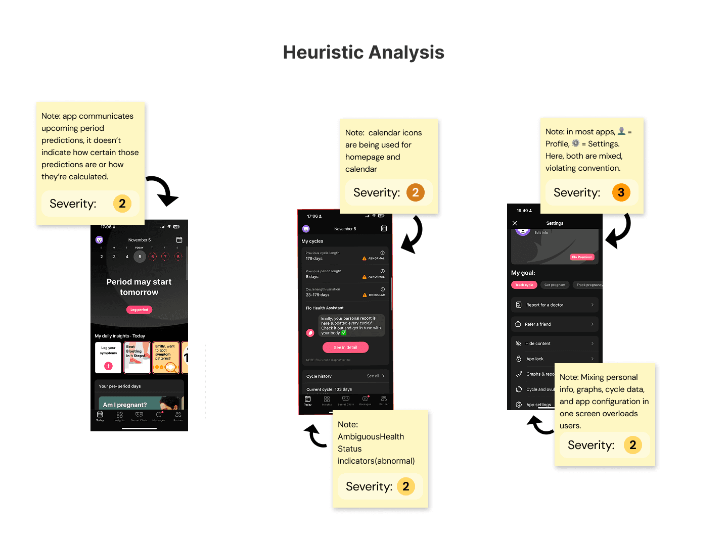
Applying Heuristics analysis
Client:
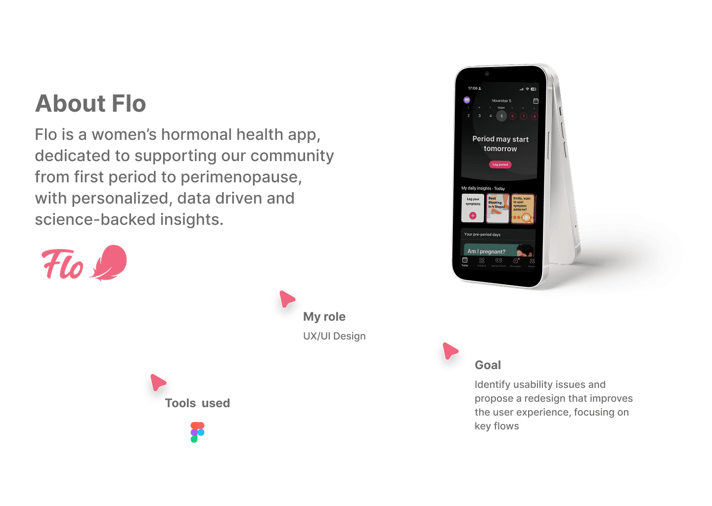
flo
Role:
ux/ui Designer
Year:
2025

The Challenge
Case Study
Applying Jakob Nielsen's Usability Heuristics to evaluate the Flo application..


I applied Jakob Nielsen's Usability Heuristics to evaluate the Flo application. The results revealed that Flo exhibits violations of usability heuristics in the areas of: Visibility of system status, Flexibility and efficiency of use, Consistency and standards, and Aesthetic and minimalist design. These small flaws can slow down the user experience, generate confusion, and cause frustration.

As part of the improvement strategy, I analysed four direct competitors; Clue, Clover, Meetyou, and Period Calendar along with broader social platforms like Instagram, Threads, and Pinterest, which consistently influence modern interface expectations.

When analysing these apps, I examined their visual hierarchy, layout patterns, iconography, and especially navigation.
The goal was to understand what users are already familiar with, what competitors do well, and where the FLO App needs to improve.

In this heuristic analysis, my solutions focused on improving clarity, reducing user anxiety, and creating a more intuitive experience. I refined the cycle alert message to make it less alarming and more supportive, using clearer and more human language. I also added transparency to the period prediction by explaining that it is based on past cycles with 85% accuracy, which helps build trust and sets realistic expectations.

Additionally, I improved visual consistency by removing a duplicated calendar icon and replacing it with the brand logo to avoid confusion. Finally, I reorganized the information architecture by separating “Profile” (personal data and goals) from “Settings” (technical preferences, privacy, reminders, and reports), making navigation clearer and reducing cognitive load.

Overall, the proposed solutions enhance usability, emotional comfort, and system transparency without drastically changing the interface.


In this heuristic analysis, I reviewed the app’s home page to identify usability issues and opportunities for improvement. Using established usability principles, I focused on how clearly the system communicates with users, how consistent the interface feels, and how easily users can complete their tasks. The purpose of this critique is to show how small design changes can make the experience more intuitive and user-friendly.
